A few months back I was given an amazing
opportunity out of the blue. Our third year University design exhibition had
appeared to be fruitful: I, along with 3 or 4 other students, had been picked
for an interview with a highly prestigious and much sought after graphic design
studio. It was actually probably close to my dream job, and without any effort
on my behalf I had been plucked out of a large number of students and invited to
attend.
The interview went shockingly. I was
ill-prepared, tired, stressed, and though I knew that this opportunity wouldn’t
come along again any time soon, I could not bring myself to participate at the
level I needed to.
I was exhausted – physically and mentally.
2013 was a huge year for me. For the entire span of the year there was not a
single time I was able to turn on my laptop without immediately bringing up the
Adobe programs. The very name of the programs in the Creative Suite made my
skin crawl. Towards the second half of the year especially, I began avoiding
phone calls from my parents and family -because in the state that I was in they
would have been more stressed out if I had answered than if I hadn’t.
It was by no means a bad year – but it was
exceptionally busy, I felt like I was drowning. I began the year in early
February as I had opted to take a summer course. Living out of home meant that
I needed to work a lot more than I had time to, and the Government wouldn’t
help me out unless I left my degree. I was working around 20 hours or so a
week, which is not a great deal on it’s own, but when combined with going to
the gym, cleaning around the house, making dinner, preparing all of my food for
each day (being gluten intolerant means that this can be quite time consuming
as most things need to be made not bought), avoiding my parents phone calls,
trying to find at least a minute a day to procrastinate and of course all of
the transport in between, it certainly adds up. Not to mention I had jobs that
I felt that I was obliged to do for family members, as well as any commitments
with my partner and his family and then on top of all of that was attending all
of my classes and trying to complete the work to my painstakingly high
standards. So busy should sum it up quite well.
And there is nothing wrong with busy. But
the problem was that I was so busy, that when I got a virus at the end of
February, my body wasn’t able to get rid of it until the end of July. And there
is a definitely a problem with being sick and busy.
So when I arrived at that interview in
December it is safe to say I was mentally ill prepared, and perhaps I didn’t
mind so much at the time. Perhaps I didn’t have the energy to mind as much as I
should have. It was my almost dream job
coming at the most terrible time possible. I felt so creatively, mentally and
socially drained and all of this had led me to have quite a fragile, and
negative mindset. Not to mention I dropped my standard for the second half of
the year and hated half of my portfolio.
In my flustered state, I skipped part of my
December intensive class to attend the interview. Wearing all black and
sweating at the palms, I made casual conversation with the receptionist at the
studio. If she likes me, I thought to
myself, then perhaps she’ll put in a good word (note that she didn’t – or else
I failed the interview so badly that it didn’t help).
1. What is your favourite
movie?
What I said: ZOOLANDER. Definitely. Without a doubt. Love that movie.
What went through my head: No, no! I was meant to say something cool and art house here, or so alternative he hasn’t even heard of it. Dammit. I could have at least said Roman Holiday. At least that has culture, and Audrey Hepburn.
What I should’ve said: A Clockwork Orange. The Graduate. Exit Through the Gift Shop. The version of Coco Chanel that has Audrey Tautou. Roman Holiday. Anything.
2. What is your favourite
colour?
What I said: Mint! But like,
not straight mint. It’s mint with a bit of a blue through it. I don’t know the
name of it though. It’s really nice, if you saw it you would understand.
Note: This was
particularly bad: a definite low point in the interview. The interviewer then
asked for the PMS colour break down and I laughed thinking he was joking but
retrospectively he was not. Bad, bad, bad.
What went through my head: Oh no. Oh god. Just stop: stop the word vomit! Mint isn’t even your favourite colour, why did you say that? Why couldn’t you have just said Black. Black is safe. Black isn’t a lie. People like black.
What I should’ve said: I am not partial to any particular colour. I love all colours equally and never show bias.
3. What is your favourite
board game?
What I said: Balderdash! Interviewer: I have never heard of it, what
is it? It’s kind of like trivial pursuit, but better. You just have to lie
and make up answers the whole time and then if you lie really well you win once
you make it to the end.
What went through my head: Oh no. Oh no Oh no Oh no Oh no Oh no. That isn’t even my favourite, that is my second favourite at best. Pictionary, I love Pictionary. Why didn’t I say Pictionary?
What I should’ve said: Pictionary.
What went through my head: Oh no. Oh no Oh no Oh no Oh no Oh no. That isn’t even my favourite, that is my second favourite at best. Pictionary, I love Pictionary. Why didn’t I say Pictionary?
What I should’ve said: Pictionary.
4. Name a famous Australian?
What I said: Cathy Freeman
What went through my head: Shit. Don’t say Cathy Freeman. Don’t say Cathy Freeman.
What I should’ve said: Peter Alexander. Bloody Alex Perry. Shit, I don’t know, Ken Cato. Someone else. This is possibly the worst answer I could have said, it is so non-design related and typical even to the point that when I spoke to another girl who had the interview, she said that she tried really hard to make sure she did not say Cathy Freeman. Even Dawn Fraser would have been an improvement.
5. What would you do if you
had a day off?
What I said: Well, I said (as I played with the idea of having a day off at some
point in the marathon of a year I had), Well,
that would depend on what season I had the day off. Interviewer: Winter.
Me: Oh that’s tricky – internally: I
fucking hate Winter in Adelaide – but I guess I would exercise at the gym
not outside, and then have coffee somewhere nice and perhaps see a friend if
they had a day off too and possibly read a book (and then this carried on for a
mile of word vomit, of all of the things I had missed all year).
What went through my head: A day off. That’s cute. I would have to fit my whole year into it though, is that possible? Should I say that I’m on team no-days-off? I am nailing this answer.
What I should’ve said: I would kick back and relax so that when I came back the next day I could work harder and be more inspired than ever.
So the moral of this botched interview for
my dream job is that you should consult your brain before talking and be prepared
for absolutely anything in a design interview. Heck, I left it feeling more
like I was making friend with a 10 year old than hoping to secure a job. And
perhaps I would have left with more confidence if that was the truth. Because I
make great friends with 10 year olds if I have to.
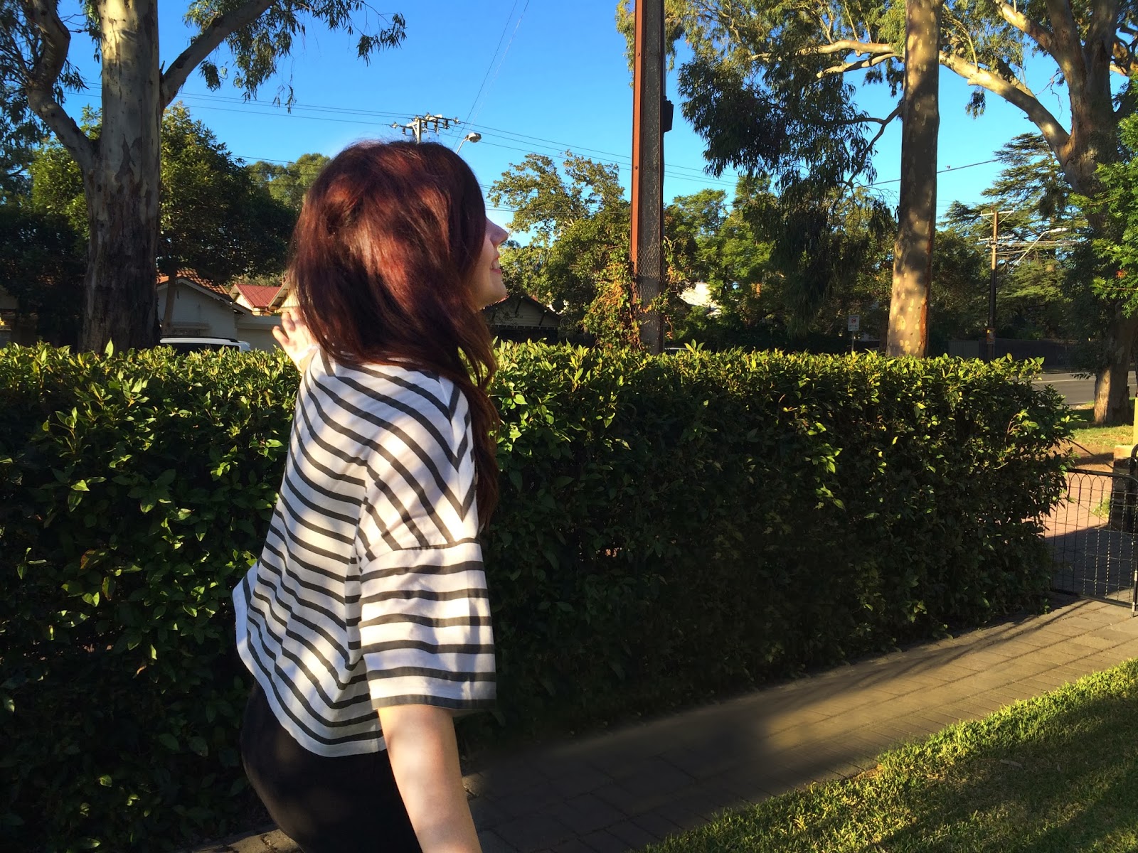
Despite my well picked outfit and neatly
brushed hair, I did not get this job.