Wednesday, 12 February 2014

A paper camera

Well this blew my mind. 

Leica have produced a camera where fine Italian paper has replaced leather. Seems like a bad idea, but looks and sounds beautiful. Thankfully the paper is very durable, and from the sounds of it may have some sort plastic influence, as it passed all abrasion, temperature tests and otherwise. Not to mention if you watch the short clip below, you will notice the choice to say that the paper was engineered by paper specialists Fedrigoni.

Leica are only producing 25 cameras with this special paper coating, and I suspect all 25 will be highly sought after by many designers for the sheer beauty and inspiration of such a playful idea. 

Scouring online lead to the discovery that the camera itself - regardless of its' beautiful paper skin - will cost you 2000 alone (and in what currency, I do ask?), thus also leading to my immediate depression. 

Where are my wealthy dead ancestors when I need them? 


Apple keeps your coffee warm

What a great idea. I stumbled upon this concept through the Taxi website, and being a lover of coffee I had to know more. At the moment it seems to just be in the initial concept stages, and as it has been created by an individual designer it will be interesting to see if it ever moves on to production. 

The apple shaped cup, spoon and saucer are designed to plug into your laptop and keep your coffee warm. Old idea, new application.

The design itself is not quite as sleek and a little too apple-forward for my liking, with the cup looking a bit too clunky and not overly functional to become a favourite. But nonetheless the idea is great, and with some aesthetic tweaking I would love to have this on my desk. 

Tomislav Zvonaric is a designer, illustrator and 3D artist from Vancouver. 


https://www.behance.net/gallery/Apple-iCup-Concept/13826933

Tuesday, 11 February 2014

The pendant lamps that stole my heart

Oh God. Major fan girling. Over a lamp... whatever. Okay, a couple of pendant lamps - but this is getting serious, I might die. I love them so much. 

I saw these in Bauhaus in Rundle Street and it took a bit of fishing around to find them online, but at last I found them.

Beautiful colour combinations and customisable choices put together with large bulbs and geometric cages serve to create the most beautiful light sources I ever did see.


http://www.empiricalstyle.com/products-page/g-empirical-pendants/ii-bright-lights/

http://www.empiricalstyle.com/products-page/cages/light-bulb-cage-diamond-customised-colour/

http://www.thespringshop.com.au/product/red-braided-lamp-cord

http://www.empiricalstyle.com/products-page/cages/light-bulb-cage-customised-colour/


If anyone who loves me is reading this, my birthday is coming up in a few months, and these lamps are calling. 

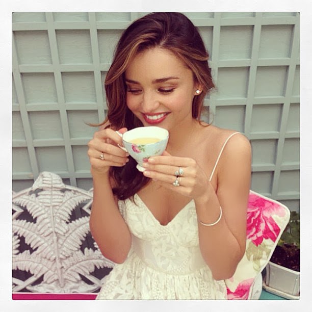
The Must Have Teacup Range

I love Miranda Kerr. I think she looks like a beautiful dolphin - and I mean that in a very nice way. The ex-Victoria Secret Supermodel and all round beautiful Australian girl has always been one of my favourites. 

I also love teacups. 

Now you may be wondering how these two things connect, and why my segue was quite so smooth, but I am very excited to have read that Miranda Kerr is combining super powers with Royal Albert (teacups) to make what is most likely set to be a floral and very popular range.

In a press release she commented saying that her inspiration had been taken from her travels around the world, her own garden, and sipping tea with her grandma. 

The teacup range is set to be released between April 22-25 in New York.


Monday, 10 February 2014

Hold onto your minds, you might just lose them: Daniel:Emma design

I just stumbled upon these two while visiting another blog and OH MY GOD I am so glad I hadn't found them sooner. Yes. Correct. Because their creations are just so beautiful that it is dangerous to my wallet's wellbeing, as well as my own. 

This Adelaide based pair of industrial designers have received enough accolades so I may just save my breath (or, fingers?). 

Let's just say their designs are beautiful, clean, and geometrical. I will honestly say that I don't always know what their products are meant to be before reading the description, but I know that I like them. 

Luckily their online shop is under construction - your wallet will live another day. 


http://www.daniel-emma.com/filter/Work

Sunday, 9 February 2014

Tres Delicious: Felici

Ahh, Felici. Long time visitor, first time reviewer. 

Felici has been around as a staple cafe for me ever since I moved to Adelaide. It used to be modern, chic, and clean - and has always made great coffee. In recent times, it seems as if they have tried to incorporate the 'hipster' aesthetic into their otherwise mainstream cafe. And unfortunately, have not quite succeeded. I think part of the problem may be because they haven't fully implemented this style; it only hints towards it, and partially holds onto its' old roots. There are elements which are simply beautiful, but altogether it doesn't quite work. The main improvement which could be made would be to change the feature wall from being wallpaper to a simple black or white paint job. This would help to tone down the store and allow it to narrow down the target audience more decisively. The fit-out by no means makes it a bad place to dine, but from a design perspective it hasn't quite hit the spot. 

Regardless, the coffee was, and has always been great. Both times I visited I ordered iced soy lattes. 

Felici's bean of choice is Di Bella, and they use Bonsoy for their soy milk. The coffee is bold and delicious, and to be honest, even though I actually visited this place twice for a review, both times it was just as good. I have no choice but to give them a well deserved 10 on the coffee front (and for all those wondering how I am giving so many cafe's such high ratings - this project is about listing the best places for coffee in Adelaide, so anywhere below standard has been disregarded). The only downfall with the service was the time it took for my coffee to be made. Both times, with only one order (with 3 coffees or less) ahead of mine, I still had to wait about 10 minutes for my coffee to be ready. 

As a side note for anyone who might want to visit, they had a sign advertising breakfast and lunch for a very reasonable $10.00.

Despite the strange taste and application of decor I would recommend this to all of my friends, and their friends too. 


Felici is located at 261 Rundle St, Adelaide.


Saturday, 8 February 2014

AIS: $500,000 rebranding

I saw an article about the rebranding of the Australian Institute of Sport logo on the ADGA website. A huge question mark has been placed by commercial media on the price tag of the new corporate identity. A massive $500, 000 fee was charged for the project, seeing a more sleek and professional identity for the company. The AIS and AGDA alike, defended the cost, explaining that it now opens doors to more investments - including internationally, as their previous logo was outdated and the branding did not reflect the excellence for which all of their athletes strive to reach.

The five lines curve like a ribbon into the shape of Australia. The lines are said to represent the core values of the AIS being sport and movement. They are also meant to reflect the lines of a running track, or swimming lanes. The red and blue of the old logo designed by a student in 1981 has been ditched, and they have donned a more fitting gold to represent the victory which they strive to achieve. I tried to find out who designed the new branding system, but unfortunately that is yet to be commented on in any of the articles which I found - for such a large scale rebranding project this itself seems a little strange.

Despite the cost provoking much heated debate and many slandering words, the branding itself has been well received. Though the previous branding - which was chosen from a design competition and showed an athlete holding hands above their head in victory - may have been relevant when it was first created, 33 years is a long time to use the same identity and to expect it to continue to be successful.

The new branding helps to make the AIS seem more prestigious, modern and strong.


Image take from the AGDA website. 
http://www.agda.com.au/news/national/1836/the-ais-rebrand---clinton-duncan